Showing posts with label mobile SEO. Show all posts

Friday 20 March 2015

How To Be Ready For The Next Google Algorithm Update on April 21, 2015?

Many website owners now started to receive warnings on their GWMT accounts telling them that their websites have issues on being friendly on mobile devices, and most of these issues are speed related.

Then Last Month Google has announced it will release an update on April 21st, which will have a significant impact on websites that are NOT mobile friendly. According to Google Webmaster Trends Analyst Zineb Ait Bahajji the coming Mobile Update will have a much stronger impact then any Panda update!


As a marketer, I now have to know how big this difference will be on my domain and where there is specific room for optimization. Because if the traffic from mobile devices continues to rise, and the wheat separates from the chaff, then I have only a few possibilities to find out the following points:
  1. What is the status of my mobile performance?
  2. What do I ideally have to do to improve it?
  3. What does my competition look like?
It is therefore even more important to have a basis of comparison in which the specific difference between my Desktop and Mobile Visibility can be recognized.


Search Metrics have already collected & analyzed data last year for providing facts about differences of the Mobile SEO Ranking Factors. The split between mobile and desktop search results is measurable. At their last Mobile Ranking Factor study in 2014 the difference of URLs between Desktop and Mobile index was already 36%.


Here is an excerpt of their findings:


"It’s for this reason that we have been tracking the same keywords for months in the mobile area as we have for desktop searches. This is, firstly, to see how the results keep differentiating more and more (which they definitely do) and, secondly, with the intention of giving our users the opportunity to have more evidence for their optimization.

And so, the time has come: the Mobile SEO Visibility (Beta) is now available as a KPI in the Searchmetrics Suite for all users, providing first indications for figuring out main differences between Desktop and Mobile SEO Visibility.

Comparability of Desktop and Mobile Visibility


The starting problem is: Desktop and Mobile cannot really be compared and analyzed to one another under real conditions. In the mobile area, there are different click-through-rates, search volumes, user intentions and the influence of local parameters on the search results is different.

Nevertheless, we want to make a comparison between Desktop and Mobile index possible and have converted our calculation of the normal SEO Visibility – which is based on a dynamic CTR calculation by machine learning algorithms – 1:1 to mobile. Why? Because we consider it to be intrinsic to prepare a mutual basis as a KPI in the form of this comparison. Especially to see how the performance is now and how it will change at April 21st.

The Mobile SEO Visibility will be updated weekly.


We have decided on an Android smartphone as a user agent. Differences between iOS and Android can occur, but in my opinion they are irrelevant, as the only differences that I have previously witnessed occur in queries for apps. For example, if you search for ‘netflix’, the Apple App Store ranks on an iPhone, whereas the Google Play Store ranks on an Android. This is also the reason why apple.com and google.com show such great deviations in Mobile SEO Visibility. Other than this, there have not been any further relevant differences between these domains so far.

Mobile SEO Visibility with desktop comparison at a glance


From now on, there are new KPIs for the evaluation of Mobile SEO Visibility (Beta) in the research area. The new search result page of the Searchmetrics Suite in the research area looks like this:


The rank overview, which was previously displayed across the entire page width, has moved to a closed circular graphic on the left side – in favor of the new ‘Desktop vs Mobile’ KPI. By the way, we have dubbed this circular graphic ‘mojo’, as in Austin Powers, as it shows at a glance how much mojo a domain has in a respective country and which channel works best!

We have also pre-calculated the Mobile SEO Visibility on all subdomains so that you can see how a mobile subdomain, such as en.m.wikipedia.org or m.imdb.com, performs.

The new KPIs and possibilities at a glance:

  • Desktop vs Mobile Visibility – comparison of visibility on the same database
    • Difference been Desktop and Mobile Visibility (circular graphic with percentage overlap of the respective Visibility)
    • Trend desktop/trend mobile – to previous week
  • Mobile SEO Visibility (SEO research)
  • Mobile Paid Visibility (SEO research)
  • Mojo with the ranks for SEO, paid, social and links
  • Toplist domains (top 10/ top 100) comparison of SEO visibility desktop vs mobile

1. Recognize problem: same database for desktop and mobile


This ‘Desktop vs Mobile’ KPI offers the simplest way to create comparability between Desktop and Mobile Visibility performance. In order to ensure this comparability, we work with identical CTR calculation and search volume on the basis of desktop values.

2. Solve problem: individual data for mobile


We know that both CTR and search volume differ in the mobile area. We have already been working with mobile data for years and have even offered mobile rankings in the project area of our Suite since June 2013. Therefore, we recommend this new Mobile SEO Visibility (Beta) only be used as an indicator in order to understand how the performance between mobile and desktop differs.

Specific analyses in the project area


For an optimum mobile measurement of performance, individual, local rankings for mobile with individual mobile search volume are necessary. We offer this data and functionality within the project area in the Searchmetrics Suite using more than 800 search machine/country/device combinations.


Conclusion: From data comparison to deep analysis


The new ‘Desktop vs Mobile’ KPI can been seen as the starting point for recognizing how big the overlap between my Desktop and my Mobile Visibility is. Furthermore, the trend shows at a glance how my performance has recently developed. Due to the fact that this KPI is part of the research area, all users of the Suite benefit from this update, which spans not only the SEO but also the PPC area.

In order to be prepared for April 21 – Google’s mobile update – and thereafter, the tracking of concrete mobile rankings is required. This is already available in the project area of the Suite, taking into account also historical developments and individual data.

Check out the current status of your Desktop vs Mobile Visibility and start projects in order to track your individual performance.

Friday 13 March 2015

The Grid | AI Websites That Design Themselves

Content is power. Power your content on The Grid. http://www.thegrid.io

This is not another do-it-yourself website builder. The Grid harnesses the power of artificial intelligence to take everything you throw at it - videos, images, text, urls and more - and automatically shape them into a custom website unique to you. As your needs grow, it evolves with you, effortlessly adapting to your needs.

The Grid's algorithms expertly analyze your media and apply color palettes that keep your messaging consistent and unique. The Grid also detects color contrasts, automatically adjusting typographic color to maximize legibility.

What's possible when an AI does all the hard work for you? You can get things done, even on the go. Drag-n-drop builders don't play nice with fingers on phones, but AI works perfectly, anywhere.

Never again change your content to fit your template or the latest hot mobile device. The layout changes as you add content, and adapts to look great and work flawlessly no matter where your users find you.

It’s as easy as that. Actually, it’s incredibly complicated, but The Grid figures it out so you don’t have to. 

Join the evolution today at http://www.thegrid.io.

Tuesday 27 January 2015

Differences Between Responsive Design, Dynamic Serving, and a Separate Mobile Site

There are many ways to configure a website for all screens. Factors to think about include the cost, time to build, your available human resources and infrastructure, and the needs of your customers.
Whatever configuration you choose, as an underlying principle we strongly recommend that you serve all your sites from a single domain, like example.com. In particular, if your desktop site is hosted on example.com, don’t put your mobile site on a separate domain, like a.com/example.
Stay with a single domain and you’ll build brand and URL equity with your users. With that principle in mind, let’s look at the three basic ways you can build a mobile-friendly website: responsive designdynamic serving, and a fully separate mobile site.

Responsive Design

Responsive web design (RWD for short) is a clever design technique that uses a single HTML code base for all platforms. That is, all viewing devices read from the same code on the same URL.  The content resizes itself to fit the screen being used, based on pre-defined breakpoints and fluid grids.
RWD requires solid up-front planning. Costs can be high at first, but once the device-specific strategy is set, maintenance can be less resource-intensive.
Pros:
·        One URL for all content. Using a single URL for a piece of content makes it easier for your users to interact with, share, and link to your content. It’s also easier for search engines to discover and index your content.
·        A streamlined user experience. Presentation of all content is customized, and device-specific features can still be used.
·        Flexible orientation. RWD naturally allows for landscape or portrait device orientation changes by users.
·        No redirects. Load time is reduced and performance increased.
Cons:
·        Careful planning required. Since all HTML is shared here, careful planning is a must to develop a truly custom and robust experience with optimal performance for each device and user.
Common mistakes to avoid:
·        Data bloat. Don’t let mobile users download full-size images meant for big screens and fast speeds. Try to reduce HTTP requests and minimize CSS and JavaScript. Load visible content first and defer everything else.
Who it’s for:
Businesses that are focused on offering a consistent experience and can plan holistically for all devices with a single web team. (Starbucks.com, BostonGlobe.com and Time.com all use this approach.) RWD can be expanded to fit new devices as they emerge, and the single URL is good for linking and sharing articles without confusion or redirects.

Dynamic Serving

In this method, the web server detects the type of device a visitor is using, then presents a custom page designed just for that device. Custom pages can be designed for any device type, from mobile phones and tablets to smart TVs.
Pros:
·        A custom user experience. Each user gets content and layout created just for their device.
·        Easier changes. Adjust content or layout for one screen size without having to touch other versions.
·        Faster loading. Your team can streamline content for optimal load times on each device.
·        Single URL. As with Responsive Design, Dynamic Serving keeps all your users on a single URL.
Cons:
·        Content forking. Multiple custom pages mean multiple sets of the same content. Unless you have a sophisticated CMS in place, keeping content up to date on all device-specific pages can be challenging.
Common mistakes:
·        Faulty device detection. Your servers will need to run scripts to recognize all available devices. This step prevents problems like the server sending a mobile-optimized site to tablet users. Your webmaster will need to keep the directory up-to-date and running smoothly to avoid bad detection or gaps in service. Another common mistake is that the server assumes a device orientation, most commonly portrait, but the user may be holding the device in a different orientation (ie landscape).
·        Changing experiences: Users will be confused if you have multiple sites and they appear radically different. While it’s important to customize for each screen size, your brand look and feel should be recognizable in all formats.
Who it’s for:
Dynamic serving is a resource-intensive solution for companies that make frequent changes to their website, and who often need to adjust display for one device, such as tweaking only their mobile site. A capable IT staff (or vendor) is a must to manage the different and possibly complex sets of website code required.

A Separate Mobile Site

A third option is to simply create a mobile site that’s separate from your original desktop site. Your system detects mobile visitors and redirects them to your mobile-optimized site (often using a sub-domain like m.yourname.com).
Only mobile users will see the separate mobile site. Users of tablets, Web-enabled TVs or other devices will still see your original desktop site.
Pros:
·        A custom user experience. This gives you the most freedom to create a separate mobile site that is designed only for mobile users.
·        Easier changes. Content or design changes can be limited to the mobile version of the site, with no effect on other devices.
Cons:
·        Multiple URLs. Sharing a web page requires careful redirects and integration between your mobile and non-mobile sites. Redirects also lead to longer page load times.
·        Content forking. Keeping two different sets of content can make data management more complex.
Common mistakes:
·        Faulty redirects. When a mobile user lands on a deep desktop page, make sure they aren’t redirected to your generic mobile homepage. Also important: avoid smartphone-only errors, where a desktop URL redirects to a non-existent mobile URL.
·        Missing annotations. The two-way (“bidirectional”) annotation helps Googlebot discover your content and helps our algorithms understand the relationship between your desktop and mobile pages and treat them correctly.
·        Inconsistent user experience: People who look at your smartphone site should recognize it as the same business they see on your desktop site. This prevents confusion and a bad overall user experience.
Who it’s for:
Businesses that for any reason need to manage their mobile site independently. For instance, some businesses may want to use a different vendor for mobile, or may want a mobile structure that simply wouldn’t be possible with RWD. Since setup is relatively easy and can be quite cost-effective, a separate mobile site can be good for small businesses with more basic site needs.


References:

  1. http://www.google.com/think/multiscreen/start.html
  2. http://www.feedthebot.com/mobile/ 
  3. https://developers.google.com/webmasters/mobile-sites/
  4. http://www.foraker.com/choosing-between-responsive-web-design-and-a-separate-mobile-site-to-improve-mobile-visitors%E2%80%99-experience/ 
  5. http://mob.is.it/blog/why-separate-mobile-site-is-usually-better-than-responsive-design 

Monday 31 March 2014

Main 4 Components of SEO: The SEO Fork

SEO is like a fork with 4 tines. It cannot work with less to be efficient.

The same is with SEO, it is the combination of 4 main branches:


1- Content (Unique, Informative, Fresh, Attractive, Specialized, Related)
2- Onsite actors (Meta Tags, UI, Speed, interlinking)
3- Social Engagement (Likes, Shares, Retweets, Pluses)
4- Backlinks (qualitative, relevant, diverse, natural, use anchor texts not KWs)


SEO FORK

Thursday 27 March 2014

Let People Know "In Real-Time" When Your blog is Updated with PubSubHubbub

As a blogger (Publisher) you want to notify the cyberspace about your new blog post, first to get it crawled faster, and second to avoid your article being stolen by another Blog and it gets crawled and ranked before you do.

That is when PubSubHubHub comes in handy as it sends realtime notifications to blogfeed hubs when you update your blog.

A simple, open, server-to-server webhook-based pubsub (publish/subscribe) protocol for any web accessible resources.

Pubsubhubbub is used for content publishing by many websites, including all blogs served by blogger.com and WordPress.com, news sites including CNN and Fox news, and social networks like diaspora

Parties (servers) speaking the PubSubHubbub protocol can get near-instant notifications (via webhook callbacks) when a topic (resource URL) they're interested in is updated.

The protocol in a nutshell is as follows:
  • An resource URL (a "topic") declares its Hub server(s) in its HTTP Headers, via Link: <hub url>; rel=”hub” . The hub(s) can be run by the publisher of the resource, or can be acommunity hub that anybody can use: Google's, or Superfeedr.
  • A subscriber (a server that's interested in a topic), initially fetches the resource URL as normal. If the response declares its hubs, the subscriber can then avoid lame, repeated polling of the URL and can instead register with the designated hub(s) and subscribe to updates.
  • The subscriber subscribes to the Topic URL from the Topic URL's declared Hub(s).
  • When the Publisher next updates the Topic URL, the publisher software pings the Hub(s) saying that there's an update.
The protocol is decentralized and free. No company is at the center of this controlling it. Anybody can run a hub, or anybody can ping (publish) or subscribe using open hubs.
Google and Superfeedr offer a public and scalable open hub for anybody to use.


How to Use PubSubhubhub with your feeds?

  • Add an //atom:link tag under //atom:entry for Atom feeds or under //rss:rss/channel for RSS feeds. The //atom:link tag should haverel attribute set to hub and href attribute set to https://pubsubhubbub.appspot.com/
  • Alternatively, your feed can be served with two Link headers:
    • one with rel attribute set to hub and href attribute set to https://pubsubhubbub.appspot.com/
    • one with rel attribute set to self and href attribute set to the feed URL of the feed
  • The above is covered in more detail in the PubsubHubbub 0.4 specification.
  • Whenever new content is added to a feed, notify the hub. This is accomplished by sending a POST request tohttps://pubsubhubbub.appspot.com/ with Content-Type: application/x-www-form-urlencoded and two parameters encoded in the body:
    • hub.mode equal to publish
    • hub.url equal to the feed URL of the feed that has been updated. This field may be repeated to indicate multiple feeds that have been updated

Hub debug

From here you can,
  • Subscribe to a feed or debug your subscriber
  • Publish a feed or debug your published feeds

If you are a WordPress Blogger and wants to Ping the hub easily, there is a Plugin for that.
https://wordpress.org/plugins/pubsubhubbub/

The Plugin does the following:

Sends realtime notifications when you update your blog
Supports multi-user installations (WordPress MU)
Supports multiple hubs
Supports all of the feed formats used by WordPress, not just ATOM and RSS2
Supports latest spec (Version 0.4)
Announces which hubs you are using by adding <link rel="hub" ...> declarations to your template header and ATOM feed
Adds <atom:link rel="hub" ...> to your RSS feeds along with the necessary XMLNS declaration for RSS 0.92/1.0

How to make the internet a better place with SEO? by Matt cutts

Does Google Consider SEO to be spam?
A 3 years old video by Mat Cutts that answers a question people still ask.

And the answer is yet the same and will still be the same:

SEO, Stands for Search Engine Optimization, is about trying to make sure that your pages are well represented to search engines. 

How?
  • By making sure the site crawlable (Robots, sitemaps, etc.)
  • Finding the Right keywords (KW and competitors research)
  • Usability and design (titles, headers, landing pages, content, multimedia)
  • Speed 
  • Responsiveness (is it mobile and tablet friendly or not)
  • Update rate (How frequent the site adds new content, and how valuable and informative it is)? 


Monday 24 February 2014

Filter Smartphones search terms in GWMTs

Here is how To know which search terms your visitors used to find your website from their mobile phones, by changing the Search Queries report from the default Web filter, you can display impressions, clicks, click-through rate, and average position for your keywords as they appeared in Google search engine results on phones.


Friday 21 February 2014

The Future of SEO is Taking your Visitors to Your Company's Kitchen

Many of you must have heard of Google's new R&D projects to emulate human interactions on website to base their ranking algorithm on the user experience and whether the visited site offered a perceived value or not.

That is why the future of SEO will not be keywords or backlinks but "Users"
Therefore, site owners need to offer a true user experience to their visitors by being more transparent with them. i.e. involving them in the kitchen :


So, Forget about the famous quote, attributed to Otto von Bismarck: 
Laws are like sausages, it is better not to see them being made.

How To Be More Transparent?

  1. Add a company page.
  2. Add images to your company page (let your visitors see you.)
  3. Add team video. Let your visitors see and hear you and your team
  4. Photos or video of your office. Let your visitors see where you work and what you offices look like.
  5. Don’t hide your phone number. This is a huge red flag.
  6. Integrate your social media accounts
  7. Show customer reviews and testimonials
  8. Embed a Google map of your office
  9. Show a photo and name of your sales person on the sales or contact page
  10. Don’t use stock photos of people in offices. Instead take real photos of your people in your offices.
  11. If you sell services, then describe your process
  12. If you sell products, then show how they get made

(I know a Toronto based SEO company called Powered By Search that has an animated photo of their office on the Main header on the Home Page showing visitors their employees while working.) 


Here are some extra guidelines from the Stanford Web Credibility Project: 


Resources:

Monday 20 January 2014

Best Analytics Solution and Page Tracking for Chrome and Firefox

   Take advantage of the power of page tagging and track important pages that indicate your business KPIs, such as the thank you page after a purchase is made. I suggest that you list all the important URLs you wish to target.
   You can use a Tool Called WASP (or Web Analytics Solution Profiler) to check if a tag was correctly inserted in your pages. When you run this extension, you can see below all the tags that are inserted in your pages and the scripts related to each.
   Wasp allows you to do quality assurance of your web analytics tags faster than ever. Test and debug your tags, save time, see detected values, find missing tags and beacons, detect double tagging, capture Flash events and export results.
   You can download it for Chrome or Firefox. 
and the Firefox Features are also here: http://webanalyticssolutionprofiler.com/firefox/features 


Wednesday 18 December 2013

How an Can an SEO Specialist Create an IPhone or Android app for their Business

There's an app for almost everything, but is there one for your business?
Just like a website, an app is yet another important representation of your identity.

As a webmaster, or an SEO specialist, you probably do not have any mobile app development experience.
So, why do not you try these tools for non-developers:


1- www.appmakr.com
If you want to see your app come together using a slick web interface, give AppMakr a try. You'll get incredibly far without having to spend a dime. Paid options allow for advanced customization and in-depth support.

2- mobbase.com  
is great for bands, share their music, Twitter feed, tour dates, and photos.

3- isites.us
will consolidate your RSS feeds from Quick Post, Blogger, Posterous, Youtube, Flickr, and other social media sites. It assembles everything into a complete app.

4- swebapps.com
lets you design advanced apps that include streaming audio, photo galleries, map and location capabilities, and even podcasts.

5- myappbuilder.com  
With this tool, you only need to provide the site dev team with your content and a "blueprint." The rest is done for you for only $29 a month.


Monday 16 September 2013

Top Free Essential SEO Tools For Mobiles


Top Free Essential SEO Tools For Mobiles 2012
Top Free Essential SEO Tools For Mobiles 


by Mina Adly Younan 

The growth in mobile browsing has been incredible over the past year. With nearly half of UK smartphone owners using their mobiles to browse and research products and Mobile Search accounting for an impressive 12% of all UK search clicks in December 2011 (Marin Software, 2012). Morgan Stanley Corp. have also found in a recent study that Mobile traffic is expected to surpass desktop traffic by 2015 as shown in the graph below.  For a website to remain its high ranking on search engines (Google) should do all needed efforts to make their mobile versions as friendly and functional as possible.
In doing so, webmasters will need the following Top Free Essential SEO Tools for Mobiles:

1- Mobilize your Site () : see how your current site looks in mobile, and find resources for building your mobile site.

2- Our Mobile Planet ():  View data about mobile users that Google has gathered. Select your key demographic and other potential customers, and view key differences.

3- Mobile Meter () gives an overview of how your site looks and performs on a mobile.

4- Google Adwords for Mobiles:  It is the same Adwords tool used for desktop searches. It gives a guideline on the monthly volume in searches. The tool can also show data for searches on mobile devices.  To do so, select ‘advanced options’ > ‘show ideas and statistics for’ > and select ‘mobile’.
Local search trends can be added to see seasonal fluctuations or if keyword searches are increasing in volume. Select columns and ‘local search trends’. This will show a simple bar graph, but if you download the data it will give some figures over time.

5-PageSpeed Insights (): test speed from both a desktop and mobile perspective. Very useful to see where the easiest performance improvements can be gained in terms of download speed. As site speed is considered part of Google’s algorithm, fixing issues could result in a real impact on mobile search positions.

6- Google Webmaster Tools for Mobiles:  It is the same Google Webmaster tool as it can also check mobile sites setup and investigate any performance issues or poor search results. Additionally, if you redirect mobile users to specific mobile versions of your URLs, then Mobile Sitemaps can be added in Google Webmaster Tools.

7- Mobilize your Business with Google Sites (): Build a test or mock up and see how it performs. The tool have different templates for several types of landing pages.

8- Google Mobile Ads (http://www.google.com/ads/mobile/): Although it is a PPC tool, it can be used to find a lot of potential methods to look at that can drive traffic to your mobile landing pages using mobile ads like:
·         Phone numbers in ads using ‘click-to-call’,
·         click-to-download
·         Mobile Ad Sitelinks
·         Seller Ratings
·         Location Extensions (Multiple Addresses too!)
·         Location Targeting

9- Speeking of PPC, there is of course there the AdMob that is now owned by Google 


10- Google Analytics for Mobiles (): The same Google Analytics for Desktop could be used for mobile browsers so that you can easily find out which mobile devices are working well, and which need optimization by asking the right questions like: Is some content getting a lot of mobile traffic but performing relatively badly? Can a page be optimized to generate more phone call leads? Which content drives more local mobile users? It is even possible to hook Analytics up to track downloads of mobile apps.


Wednesday 11 September 2013

Bounces to Leads Converter - The Ice Breaker of E-Commerce

I got a crazy idea that I believe will rock the SEO world.

let's agree first that SEO (and PPC) are not about traffic anymore but about Revenue and Sales.

Even if you are not selling any product, you need the traffic to sell ads of third parties.

OK then..

Do you know that the only challenge in SEO (and PPC) campaigns is not to drive traffic but to keep them? and what is really more challenging is to convert them to Leads to buy what you are offering.

70-96% of visitors abandoning your site will never return  

Here are even more facts:


  • 90%-99% Of Your Marketing Spend Is Completely Worthless
  • Email is a phenomenal profit driver, however most websites capture less than 1 in 400 emails from visitors (who have not purchased)
  • Up to 85% of shoppers who add to cart DO NOT BUY ANYTHING


Imagine:

Mrs. Lynda owns a store in a Big Mall and Mr. Christopher happened to pass by her nice store when he was doing his weekly shopping. He stayed for a couple of minutes, went through her products, felt interested in some of them, checked the prices, thought of dropping her store another visit when he is prepared to buy, then he left. 

30 minutes later, he entered another store selling the same products like you do, but the store looked better with more promotions and friendly staff. A cute saleswoman broke the ice and approached him. She asked him about what he is looking for, they talked for a while, she showed him some products, he was convinced and bought what he needed. 

And never came back to poor Mrs. Lynda who is selling the same thing. 

The Lesson here is: Sales NEED Ice-Breakers 


So,
The tool I created is not an invention per se albeit it does not exist yet. 
It is a combination of 3 already existing tools, but in one All-In-One Powerful onsite SEO tool
That I will call The Bounces2Leads Tool (AKA, The Ice Breaker of E-commerce) 

What it does:

It simply detects when a visitor abandons the website, then after they do, a window appears asking the visitor to chat with a representative if they have any inquiries before they leave.  
So, it is using the Bounce Exchange service but instead of popping up a banner, it will pop up a chatting window with a real person representative. 

Here is How Bounce Exchange Works:


As for the chatting services you can find hundreds of software online to choose from (I prefer those that can forward chats to Google Hangouts and can go mobile)

Finally, you can have an email marketing software to manage your newsletter in case your visitor preferred to leave their email address instead of chatting with a rep. 

But why have 3 services with a cost more than 3000$ if you can have only one that does it all for a fraction of that price (I did not price it yet but it will be way cheaper)


Thursday 11 July 2013

One Page Website Vs. Multiple Pages Website: Which is More Engaging? With Examples of Best Single Page Sites I found

We all grew up in an internet world where sites have pages to look like books. But those who created that trend forgot that books 'have to' consist of many pages to be easier for the readers to hold them, put them in their bags, bookmark where they reached, and above all save space. 


But do you know that before books people used to write long content in a very long manuscripts that they used to roll. It was not handy of course and made life very complicated for readers back then. But let’s face it, reading was more appreciated and people were more engaged to the read content. Right? It was not about how many pages did I read today but what did I in terms of chapters or books or ideas.

When it comes to the internet, our modern source of information, we use websites to nourish our minds. Do we want content on these websites to be engaging and fluid or we want to navigate between pages, sections, and categories? 
The answer to that is not easy nor simple. Because it depends on what content do you have and how do you want to present it and above all who is your target audience.

But the Key is: 
YOU WANT TO KEEP THE FLOW! and DON'T WANT TO BREAK THE NARRATION while being well-indexed on search engines and have easy on site navigation


‘Single page themes’ / ‘One Page Website’?  

The websites in this article let you scroll, but they also provide alternative ways of finding cues and means for getting around. In several cases the designs encourage exploration, which is both more engaging and also teaches you how to navigate at the same time.
Timeline on Jess and Russ's website.

Jess and Russ

The Jess and Russ’s website is a wedding invitation, though it’s also something more. As it says at the top of the page, it is the story of Jess and Russ leading up to this moment. It’s a narrative that begins with a few details before they had met, leads to their meeting and falling in love, and culminates with the invitation (complete with RSVP form).
Jess and Russ's RSVP.
How do you navigate a story that’s told linearly through time? Sure, there are flashbacks and other narrative devices, but for the most part you tell the story from beginning to end. You move through it in a straight line and so here the navigation is simply scrolling through the page. Nothing more is needed.
I started this post suggesting we could provide more than scrolling. This example shows that, at times, scrolling is the most appropriate way to navigate. Jess and Russ’s website could easily have been broken up into several pages (navigated through the “next” and “previous” links at the bottom and top of each page). That would still keep things moving linearly, though each click would momentarily disrupt the narrative. In this case scrolling was the better choice.
Fortunately the website makes us want to scroll. Along the way we get an engaging story, filled with wonderful artwork and with interesting parallax effects. With this website you won’t get bored scrolling — instead, you’ll be looking forward to the next part of the story and how it will be told.
Artwork from Jess and Russ's website.
The story your design is telling may not be as linear as this one, though it’s likely parts of it will be. The lesson from Jess and Russ is that when you’re designing the linear parts of a website and you want people to move through it in a single direction, scrolling is possibly the best option. You also may want to consider a single, longer page as opposed to several shorter ones that are connected by links.

Ballantyne

Ballantyne creates luxury knitwear from cashmere. The website itself contains different types of information. There is the standard “About Us” and “Contact” information, as a start. Beyond that there are product images and chunks of text to go along with the images. It’s easy to imagine yourself thumbing through the pages of a catalog when browsing through this website.
As with Jess and Russ, this website is entirely on a single page, and as such, scrolling is once again a predominant way to navigate. It’s not the only way this time, though it’s perhaps the more interesting method.
Ballantyne.
On the landing section for the domain there are links that read “Established 1921″ and “Contacts”. Clicking the former scrolls the page up to see the “Who We Are” section (the “About Us” info) above. The latter scrolls you through all the images and text to the bottom of the page as well as the contact information.
When arriving at either of these ends of the website you’re also presented with additional ways to navigate. The “Who We Are” part of the page contains an “X” to close it, though this information doesn’t actually open or close — it just scrolls you back to the main landing section for the page, which you can also do yourself.
At the top of the contact section of the page a header drops down containing the company name and the links for “Who We Are” and “Contacts”. Unfortunately, the company name isn’t clickable, which is conventional for navigating back to a home location.
You can equally scroll through these two end sections of the page. As you do, there’s a nice parallax effect. The outer two columns scroll as you’d expect, while the middle column scrolls in the opposite direction. The effect creates additional interest beyond simple scrolling as more information and imagery pass through your view. The two header links along with the company name are also present as soon as you scroll below the root landing spot.
Contact section on Ballantyne website.
As with Jess and Russ, the Ballantyne website is more enjoyable to scroll than most. Here we’re also given an alternative means of navigation in addition to scrolling. There are a few problems, though:
  • No link is provided to navigate back to the original landing location. You have to scroll to get there, or first go to the Who We Are section and close it. This seems odd.
  • Clicking to either “Who We Are” or “Contacts” isn’t quite a smooth experience.
  • There’s no way to scroll up to the “Who We Are” section.
  • The link at the landing location to “Who We Are” reads “Established 1921″ and isn’t clear where it leads.
Another minor complaint is while scrolling, the images don’t always align where you’d like them to — you see a full image in one column, but not the others. This might have been done on purpose to get you to scroll slowly through the website, but I kept wanting things to align better. While it won’t affect your experience of the website, it can be a little jarring.
Even though the above items could be improved, they hardly cause problems when navigating the website. We’re talking about a limited amount of content, and within a moment or two, you’ve figured out where everything is. While clicking to the end locations isn’t the smoothest experience, seeing everything scroll from one end to the other does show you quickly how to navigate the entire website. In fact, it’s this behavior that cues you in if you didn’t immediately realize to scroll.
The lesson here is that even if your page will most likely be scrolled, you can still provide alternate options to navigate and help people understand what’s located on the page.

Cadillac ATS vs The World

Unlike the two websites above, Cadillac is a website with a couple of separate pages. Here we’ll look at one section of the website, specifically one page within that section. One of the ways Cadillac is promoting the ATS is as a vehicle that can take you anywhere and exhilarate you as it does.
The designers have set up a section of the website where you can explore four interesting locations around the world that you might not ordinarily get to see. It’s these location pages that we will consider here.
Cadillac ATS vs the World.
navigation bar remains fixed at the top of each of these pages making it easy to get back to the main section page, or switch to one of the other three locations. If you hover over the Cadillac logo, the global navigation appears and allows you to get to any part of the website.
We’re here to explore though, and there’s an immediate cue for how to go about it. An animation of a series of arrows pointing down suggest that’s where we look. They direct your eye to another downward pointing shape with the words “watch the video”. Shape and words are a link.
Cadillac ATS China.
Clicking scrolls a video from below into place. Below the video is another now familiar downward pointing shape with the words “ATS vs The Wind”. Clicking once again scrolls content from below, this time complete with a change of background image and parallax effect.
Each subsequent click scrolls to a new part of the page. You can navigate the entire page by clicking one shape after another until you reach the end, where you can check in (share on FaceBook, Twitter, or Google+) or visit one of the other three locations.
You could, of course, scroll through the entire page instead of clicking at each stop — you’ll experience the parallax effect a little more, but otherwise navigating the page will be the same until you want to move back up the page (as there are no upward pointing shapes to click).
There are two additional ways to navigate, both located along the right edge of the page. At the very edge is a scroll bar, though not the default one that comes with the browser. It works exactly as you would expect and provides an immediate cue that there’s more on the page than on the screen.
Just inside this scrollbar is a long thin column with a series of lighter and darker dots. Clicking on any dot will take you to a specific section within the page. The dots also offer additional clues about the page.
Lighter dots mark the start of a section. Darker dots take you to a location within each section. Each section is further reinforced by a line separator.
Clicking any dot scrolls the page to the given section or sub-section. Hovering brings up a tool tip pointing to the light dot and containing the heading for each section.
Hovering on the Timeline of Cadillac ATS China.
As with the websites above, everything here works well — the content is limited, and it won’t take long to work out the organization. You’re also encouraged to explore each location in each section, and cues are provided to help in your exploration.
  • The downward pointing shapes invite you to click and get started.
  • Content scrolling into place after a click suggests you can scroll the page on your own.
  • The scroll bar along the right edge further suggests scrolling and provides another mechanism to do so
  • The chapter/timeline feature might be the last thing you discover, but it’s ultimately the quickest way to navigate the page.
Each location is a new destination to explore — both literally (as a new page) and figuratively (with the content each contains). It’s part of the fun, and puts you in discovery mode from the start.
Aside: The main Cadillac website has more conventional navigation (a horizontal navigation bar with drop-downs), though it’s very nicely done and worth a look. The drop-downs present quite a bit of useful information.
The lesson here is that you can provide several ways to navigate for different types of visitors. You should provide immediate cues for how to begin navigation and let more advanced users discover other means to navigate as they explore.
Bleep Radio.

Bleep Radio

Bleep Radio also encourages you to explore their single-page website. Unlike the websites above, there’s less of a directional nature to the scrolling. What you want to do could be located on any part of the page. As with the Cadillac ATS pages, there are visual cues in the form of triangles that suggest they are clickable for navigation.
Any browser open to at least 1200×900 will see most of the main menu, which is inside a large triangle showing the word Discover (again, encouraging exploration). The program link takes you to a section above the page (like Who We Are on Ballantyne). Again, there is an X to get back.
Aside from the Program link, most of the other links are located in the main Discover triangle. And of course, you can scroll up and down the page to find different content.
Bottom of Bleep Radio Website.
While the layout is certainly original and interesting, I don’t think the navigation here works as well as with the other websites, for a few reasons:
  • Unless you navigate to a section toward the top or bottom of the page, you’re left without navigation back besides scrolling. The discover triangle is only present at the top and bottom.
  • Some triangles are clickable, while others aren’t, creating a bit of confusion as to what is and isn’t navigation.
  • The page is always wider than the browser, no matter what size it’s opened to. Scrolling vertically will at times shift things to the right or left.
In all fairness to the website, it’s written in Greek (and I don’t speak Greek) so I could easily be missing some obvious cues.
On a more positive note, the website does have some qualities that are both nice and fun:
  • Clicking the Just Bleep triangle at the top clears away most of the content on the page so that you can focus on the task at hand. Nothing specifically happens for me after clicking Just Bleep (though I’m guessing it would, were I logged into the website).
  • The bleeper section is a grid of member images. There are a few triangles sitting atop the images, and hovering over them results in their shifting to the right or left. There’s no functional purpose, but it lends an interactive feel to the website.
One other thing to point out is the triangle along the right edge that remains fixed in place when scrolling. Clicking on it opens the current on-air Bleep, along with some social buttons. I can’t help but think navigating the website would be easier if the Discover menu was similarly fixed in place along the left edge.
The lesson here is that a unique and creative design can encourage exploration, however you should be consistent in your navigational cues. If a shape, color or specific style is a link in one place, it should be a link everywhere it occurs, or it risks confusing your visitors.

EVO Energy: The Interactive U.K. Energy Consumption Guide

The Interactive U.K. Energy Consumption Guide from EVO Energy is what information graphics on the Web should be. As with the Cadillac website, we’re looking at a single page within a larger website. And as with all the pages, the primary way to navigate is to scroll from top to bottom.
However, scrolling isn’t the only way to navigate the content here. You are expected to interact with the page in order to get most of the information it contains.
UK Energy Consumption Guide - Primary Energy Consumption in 2010.
For example, the first interactive section on the page offers data about the total primary energy consumption from fuel used in the United Kingdom. The main graphic is a tree with circles of various colors representing leaves. Each color is associated with a different type of fuel…
  • Electricity
  • Biomass
  • Gas
  • Petroleum
  • Solid Fuel
The more colored circles are shown in the graphic, the greater that fuel contributes to the total. Each of the fuel types are listed in another graphic to the right, and hovering over them reveals the actual percentage of the fuel within the total.
To the left is another list allowing you to view the same data over different decades. With a couple of hovers and clicks, you will see that solid fuel accounted for 47% of the total in 1970 and only 15% of the total in 2010.
UK Energy Consumption Guide Primary Energy Consumption in 1970.
There’s little in the way of text on the page outside of a few basic bits of information and occasional instructions. It’s hardly needed (though it could enhance the graphics some).
These interactive infographics take advantage of what the Web can do and through interaction the information sinks in a lot more. You aren’t just being presented information — you’re actively selecting the information you want to see, making it more likely that you’ll pay attention and remember it.
The only issue I have with the page is that some panels aren’t interactive. After interacting with so many, I felt cheated when all of a sudden I couldn’t interact with one.
The lesson here is that navigation is more than moving about a website or Web page, it can also be a way to bring content to you in place. Instead of something that takes your visitors from one location on a page or website to another, navigation can be about replacing content in place — it’s a much more engaging way to interact with a website.
UK Energy Consumption Guide Final Energy Consumption Transport.

SEO advice for one page WordPress websites


Use these techniques to make your one page WordPress website search engine friendly.

Optimise the website for a single keyword/phrase plus one secondary keyword

When creating a one page website, it can be tempting to cram in as many different keywords as possible. Don’t!

If you’ve decided on a one page website then you’ve presumably decided to keep things simple. Rather than stuff your website full with detailed descriptions of all your products and services, you want to provide a brief overview about each area of your business.

Boost your SEO with blog posts

Many one page WordPress themes, including SCRN and QuickStep, allow you to create separate blog posts that are linked to from the homepage. This stops the page from becoming excessively long.
Having separate blog posts is a great opportunity for separate keywords.
Each time you write a blog post, optimise it for 1 or 2 keywords. Include these as often as possible (without looking spammy) in the post url, title, headings, body text, etc. Use the fantastic WordPress SEO plugin to create custom post titles and meta descriptions based around these keywords.
Write additional blog posts optimised for the 1 or 2 keywords used on the homepage. This will reinforce the importance of these main keywords.

Consider the use of additional pages

I realise this wouldn’t strictly make it a one page WordPress website! However, lots of one page WordPress themes actually allow you to create additional pages if you choose to do so. This involves adding all your main content to the main homepage, and creating additional pages and linking to them either via the navigation menu or via links on the homepage.
Anyway…… If your WordPress theme allows you to create additional pages then these can be optimised for other keywords in the same way as I described for blog posts, above.

Internal links on one page WordPress websites

Internal links – i.e. keyworded links pointing to other areas within your website – are important for SEO. They’re not one of the first things you think of with one page websites. However, some careful planning will allow you to have an internal linking strategy for a one page WordPress website:

Create anchor links allowing users to jump up and down to relevant content within your main page.

Link between your main page and blog posts (plus any additional pages), and between your blog posts.


  • Choose appropriate navigation based on the needs of the content.
  • Provide alternate forms of navigation when it benefits your visitor.
  • Provide immediate and obvious cues about how to navigate.
  • Offer advanced ways to navigate for advanced users.
  • Encourage exploration, but don’t require it for navigation to be usable.
  • You don’t always have to take people to the content — you can bring the content to them.
Hopefully this brief look at the websites above will get you to explore further and help you generate ideas for alternate ways to navigate content.

More Examples


1. Minimal Content

When designing a single-page website, limiting the amount of content is important. First of all, rememeber that all your content needs to load at one time (unless you’re using Ajax, but even then there’s sometimes a fair amount of content to load at once). Also, if you want to use transitions between your content areas, they often work better when there isn’t a huge amount of content to cover between sections that aren’t bordering each other.
Five or six separate content areas seem to be about the norm on many single-page sites. Some sites limit it to only two or three, even. It’s rare to see a site with more than ten different content areas on a single page.

Examples

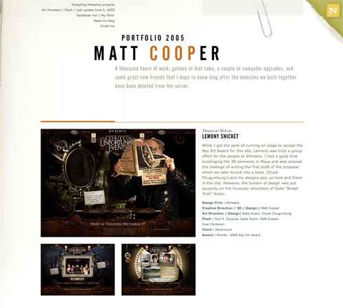
A single-page portfolio site that showcases a dozen movie websites. Minimal information is provided in the header, including a contact link.
Colourpixel has a lot of varying information on their site, but for the most part everything is kept short and to the point. There’s contact information, a portfolio and about information, all on a single page.
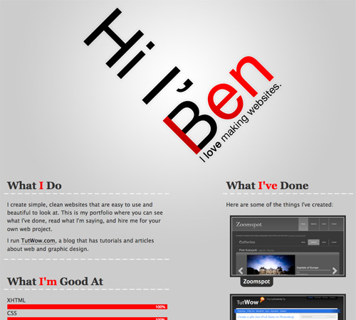
Ben Lind’s website includes only the minimum amount of content to get his message across.
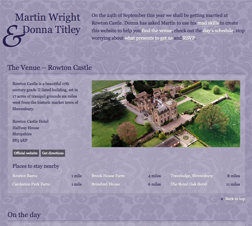
Single-page sites are perfect for things like events (a wedding in this case). There’s not too much content to include and the single page makes it easy to find whatever you’re looking for.
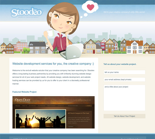
Stoodeo’s site only contain’s a single page worth of content. By placing the contact form to the side, they’ve really minimized the length of the page.

2. Consider Horizontal Scrolling

Not all horizontally-scrolling websites are single page sites. But a fair number of them are, and it’s an interesting way to break out of the standard single-page box.
Horizontal scrolling can also work better if you have more content. Combining a horizontal layout with JavaScript can also facilitate larger amounts of content without overwhelming the visitor.

Examples

This site incorporates both horizontal and vertical scrolling to get six pages worth of information on a single page.
F Claire Baxter’s site is a fantastic example of using JavaScript to create a site that smoothly scrolls horizontally.
Charlie Gentle’s website uses a horizontal-scrolling slideshow effect to display content.
A huge horizontally-scrolling single page site. They include the contact form right at the beginning, setting it apart from a lot of other horizontal sites that include it on the last screen.
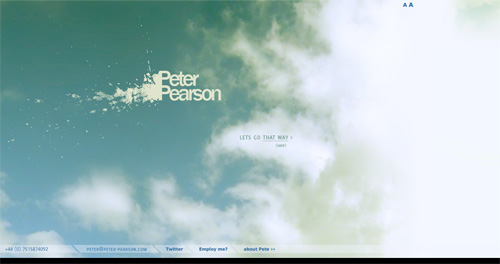
Peter Pearson’s site uses a mix of animation and horizontal scrolling on his site. Multiple pages worth of content are broken up across multiple horizontal screens.

3. Consider Screen Size

With a single-page site, you may want to consider the visible area your visitors likely see within their browser. Crafting your pages to fit comfortably within that space can minimize scrolling while viewing individual sections. This can be particularly important if the transitions between areas are important to you. Once a visitor starts scrolling, they may just keep scrolling rather than using your navigation links.

Examples

This is a very simple, three-screen single page site. Each section of the site easily fits within a single screen and requires no scrolling. The use of bi-directional scrolling to navigate is also a unique touch.
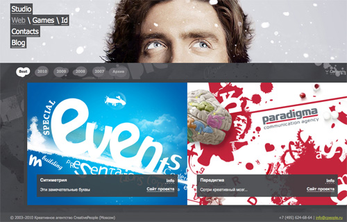
The CreativePeople website uses accordian sliders that come up from the bottom of the screen to display content. No scrolling is required.
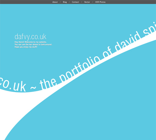
Each content area on the Dafvy.co.uk site fits easily within a single screen with no scrolling required. The background color transitions that occur when you click to navigate to each individual section is a very nice touch.
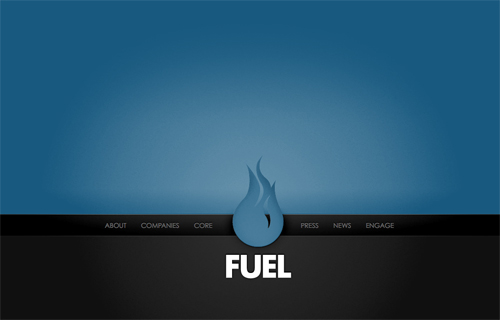
Fuel Brand uses a single-page that fits within your browser window and uses Ajax to show more content.
A simple site with a slideshow and minimal information. The content adjusts to your screen size.

4. Clearly Set Apart Each Section

Most visitors to your site are going to be used to loading a new page for new content. If you squish all the content on your single-page site too close together, they may not see the transitions from one section the next.
There are a variety of ways to differentiate between sections. Using a header for each content area is one way. Some sites use an actual line to separate different areas. And still other sites use ample amounts of white space to set areas apart from one another.

Examples

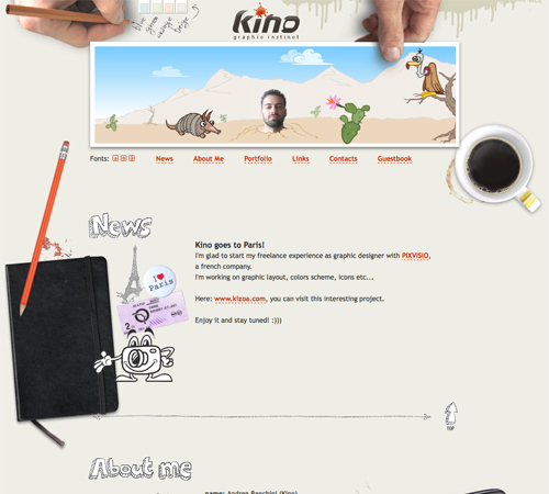
KINO uses consistent hand-drawn headers for each section of the site, along with a thin, hand-drawn border separating each one.
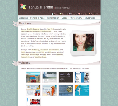
Simple banners between each section keep a consistent look throughout the page while setting apart each content area.
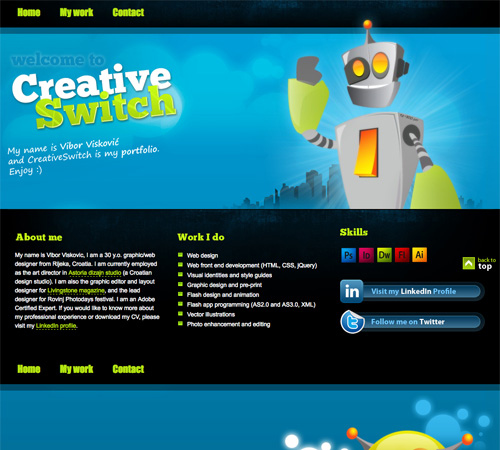
CreativeSwitch uses images similar to distinct headers for each section of the site, clearly marking transitions between different types of content.
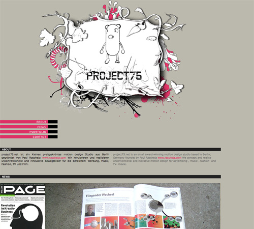
Even something as simple as a thick black bar can be enough to set your content areas apart from each other, as is done here.
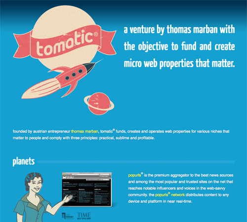
The Tomatic website uses a retro rocket and space exploration theme. The header includes a rocket with planets. Various other sections on the site continue the retro theme, and then the footer includes a robot and UFO on a planet’s surface. Each section is set off with a unified header.

5. Take Advantage of a Bigger Background

Big backgrounds are popular in all kinds of website design, but single page designs open up new possibilities for large backgrounds. Many designers take advantage of large background images as a way to set apart their content areas while maintaining a unified look to the entire site.
For example, some sites might have a scene in the background that starts with a sky at the top with one content area, then further down they have a ground-level scene with another content area, and at the bottom they have an underwater scene with yet another content area. The possibilities with this kind of site are almost endless.

Examples

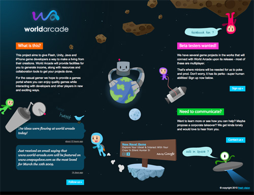
This coming soon page is another great example of using a unified theme throughout the site.
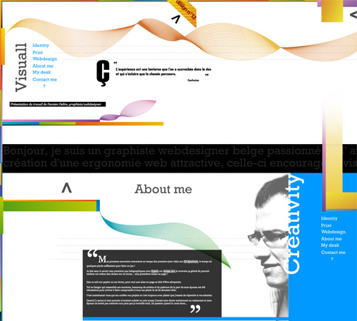
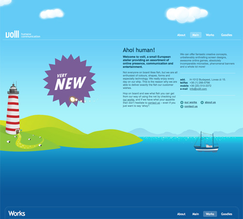
The Volll site uses a seascape/landscape image for the background, with the main content at sea level. Additional information shows up above the main content in the sky and below in the water, right down to the ocean floor.
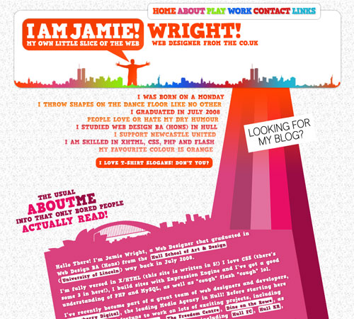
Jamie Wright’s site uses a more abstract, colorful theme throughout. It really sets the site apart and draws your attention exactly where it should be.
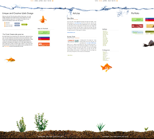
Luke Larsen’s site uses a background that resembles a goldfish bowl.
This is one of the most innovative background designs I’ve seen. As you scroll down the page, colored bars in the background interact with other background elements to produce a one-of-a-kind effect that’s hard to even explain (so go check it out!).

6. Use JavaScript and Ajax to Organize and Display Content

If you have a bit more content to display but still want to stick to a single page design, consider using JS and Ajax to hide some content while others is displayed.
Slideshows are the most popular techniques for incorporating JS, but modal windows and other methods are also used.

Examples

SOFA uses JavaScript to display content on the home page as needed. It results in a very clean, polished design that still presents the necessary information without requiring visitors to leave the main page.
The Giant Creative site uses a JavaScript slideshow to display content while keeping the visitor on a single page.
Deluge Studios uses a variety of slideshows, modal windows, and other JavaScript techniques to include more information on their website than is immediately apparent.
The TapTapTap website uses JavaScript to load information about each of their products without loading a new page.
Jon Brousseau’s site uses JS for subtle enhancements like modal windows and tooltips.

More Examples

Below are a bunch of other great single-page website designs.
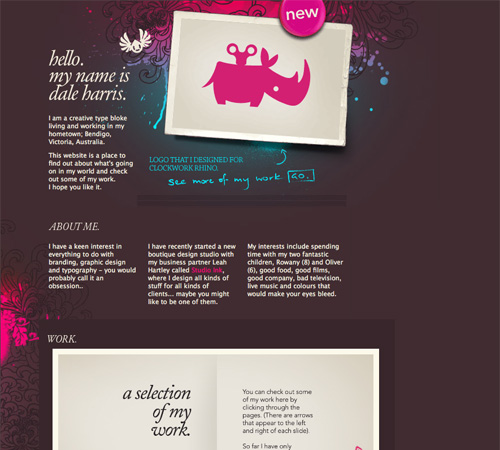
Dale Harris
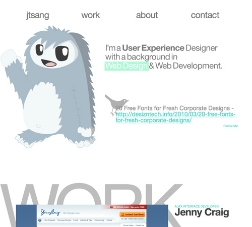
Justin Tsang
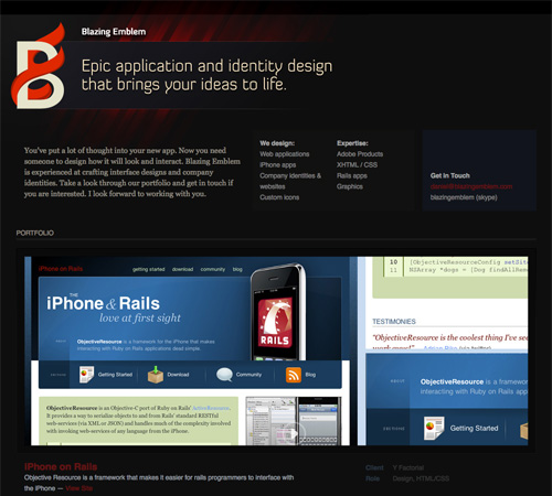
Blazing Emblem, LLC
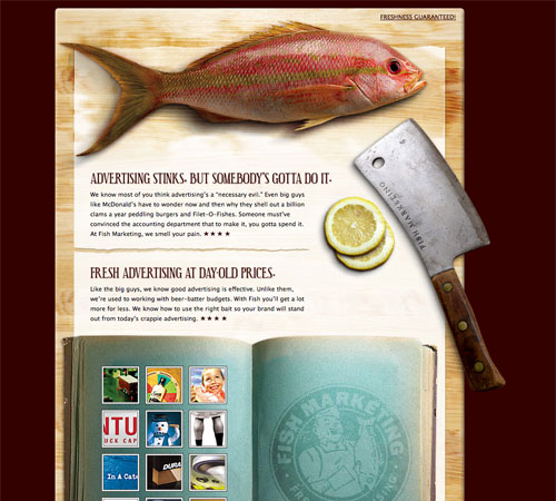
Fish Marketing
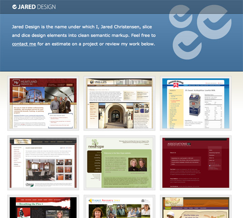
Jared Design
Angel Des Lacs
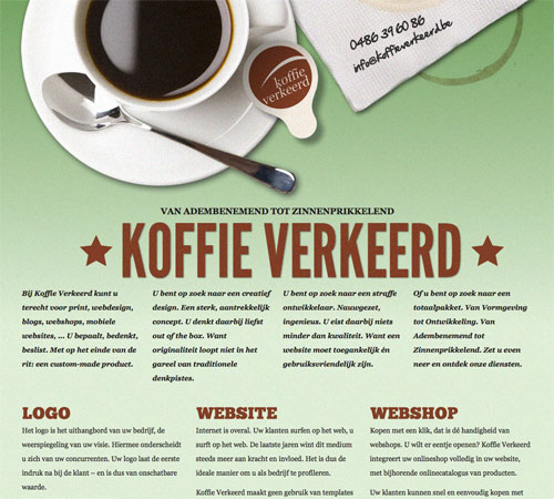
Koffie Verkeerd
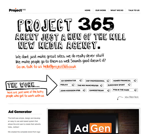
Project 365
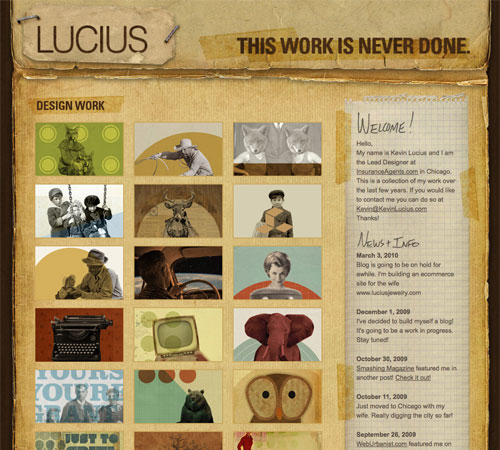
Kevin Lucius
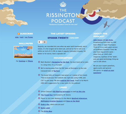
The Rissington Podcast
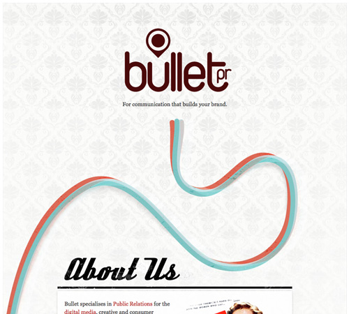
Bullet PR
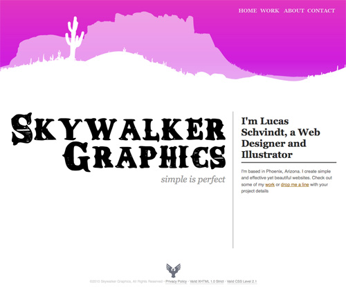
Skywalker Graphics
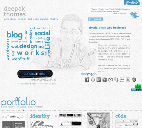
thinkdj
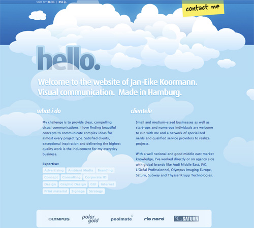
Jan-Eike Koormann
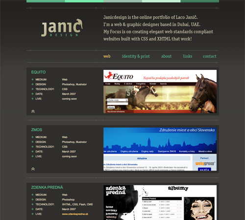
Janic Design
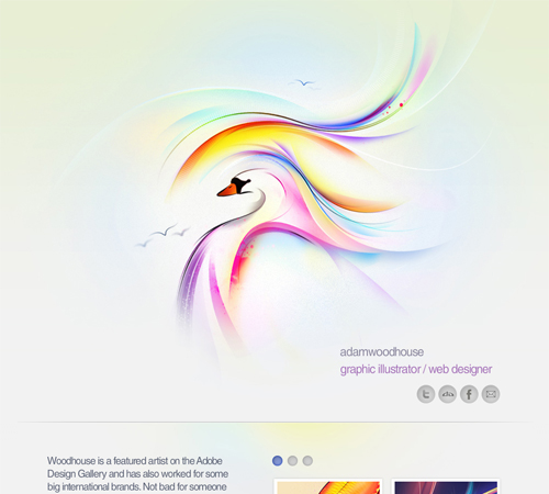
Adam Woodhouse
Paolo Manganiello
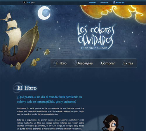
Los Colores Olvidados
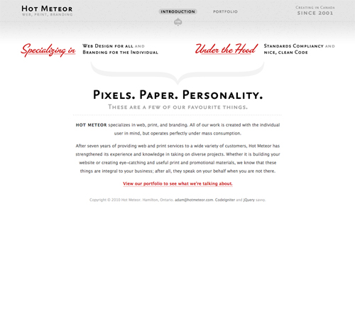
Hot Meteor
IndoFolio

In Review…

One-page websites can be a fun and different way to design a site, whether it’s your own personal site or for a client. Consider ways to differentiate your one-page site that might not work as well on a multi-page site. Things like big background images or certain Ajax techniques work really well on one-page sites and have a bigger impact than they do on more complex sites.
Here’s a quick run-down of the best-practices mentioned above:
  1. Minimal content. There’s only room for so much content on a single page.
  2. Consider horizontal scrolling. While not all horizontal-scrolling websites are single pages, it’s a format that lends itself well to the one-page format.
  3. Consider screen size. Creating content areas that fit within a visitor’s screen without requiring scrolling is common in single-page sites.
  4. Clearly set apart each section. You don’t have the convention of separate pages for different content, so you need to figure out another way to delineate content areas.
  5. Take advantage of bigger backgrounds. Single page sites are often longer or larger than other pages, giving more opportunities for creative use of big backgrounds.
  6. Use JavaScript and Ajax. Organizing a lot of content on a single page can be enhanced if you use Ajax or JS techniques like modal windows, tooltips and sliders.

Showcases


Resources: